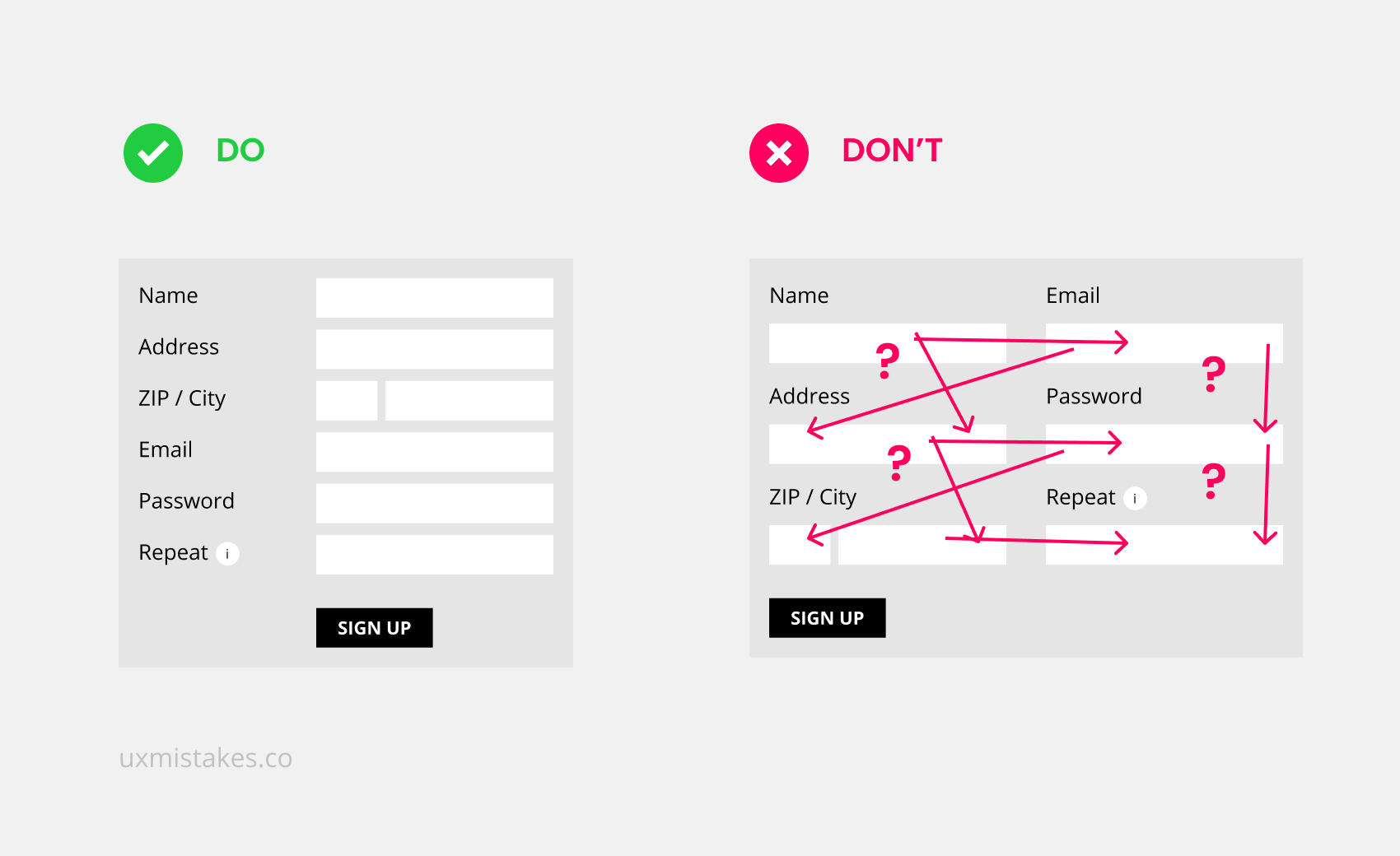
Nobody likes to fill out forms, but they are a crucial part of user interfaces. Splitting your forms into more than one column might look like an efficient way of using space, but introduces many issues.
The direction of input is not clear. Are you supposed to go from top to bottom and then to the next column or finish all columns of the row before going to the next row? And when people are using the tab key to jump to the next field, what is the next field?
Take this action
Check all your forms and redesign if necessary. You need a one-column-solution for small mobile devices anyway.